Showing posts with label Dashboard. Show all posts

Wednesday, June 3, 2009

Why Analytics Help


Lately, I've been getting a lot of requests to help organizations with data analytics and reporting aspects of their CRM solutions. I'm very encouraged by this, because it means companies are using their CRM for more than just managing customer relationships better. They are also using these tools to understand and improve their own business processes better!

A methodical analytics process is important, because it forces you to (1) define goals for your organization, (2) monitor and track performance against these goals, and (3) drive continuous process improvement based on objective, measurable results.

Let me share some of the results from the “Great Dashboard Clean-Up Project”, which I’ve talked about in past blogs.

On this project, I've worked with a number of cross-functional areas -- but this post will focus on work done with Support team. Our Customer Support organization receives high accolades from customers with respect to our response and handling of cases. It's really nice to get this unsolicited feedback from Customers, but the division manager wanted to track the teams’ performance with more objective data.

Together, we defined some Key Response Areas (KRA) for his team:

Time to Respond: After a Customer contacts us (through email, phone or web), how quickly does the support organization respond to that Customer?

Time to Restore: If the call is related to an operational issue or problem with our product “in the field”, how quickly does Support restore that equipment to full operational service?

Time to Resolve: How long does it take for the Support team to fully resolve (close) a Customer case?


We set goals for each of these KRA. This was very easy, as the organization already had internal, implied Service Level Agreements (SLA) documented. We simply “fine-tuned” the definition of those metrics, and published them to Customers:

Time to Respond
o Email / Web – contact and/or reply to Customer within 24 Hours
o Phone – if unable to answer immediately, call back within 15 minutes

Time to Restore
o Sev-1 (Critical Priority) Cases – Restore service within 4 hours
o Sev-2 (Urgent Priority) Cases – Restore service within 6 hours
o Sev-3 (Standard Priority) Cases – Restore service within 24 hours

Time to Resolve
o Sev-1 / Sev-2 Cases: Close within 7 days
o Sev-3 Cases: Close within 14 days


Here’s where things got a little tricky. While we had customized our Salesforce.com CRM system heavily to support our business needs, there was no customization centered around many of these SLA metrics. For instance, we could easily count the number of cases received from each Customer, and even identify how those cases originated (email, phone, web) -– but we had no fields tracking if phone calls were missed / returned within 15 minutes, or if email / web inquiries were responded to within 24 hours. We had Case-related fields tracking when a case was opened and closed, but for operational problems in the field, we had no date/time fields tracking when service was "restored".

Fortunately, Salesforce.com excels in this area. It was very easy to add some custom fields tracking all these SLA metrics. We also added some workflows and apex triggers that automatically populated the fields based on various conditions.


With these metrics in place, we created reports and dashboards to benchmark the Support Organization's current performance. We immediately saw that we were, in fact, doing very well across these metrics. Phone calls were answered (or callbacks returned) within 15 minutes 96% of the time. Email and web based cases were responded to within 24-hours 70% of the time. Operational issues were being restored and resolved within SLA almost 90% of the time. This all validated the compliments and feedback we had been receiving from Customers directly. But it was just the starting point for our project.

Now that we were measuring the data, we could easily zero in on the exception / failure cases. Why did we fail that SLA? What changes could we put in place to prevent us from failing in a similar way next time?

We’ve had this program in place since January, and the results (from our Support Operations SLA Dashboard) speak for themselves:


Across every metric, across every SLA, our Support Team has steadily and consistently improved in it's performance. All of this is through our CRM business analytics and service improvement program.

How about you? Are you getting the most from your CRM?

Sunday, January 25, 2009

The Great Dashboard Clean-Up: Roles, Data Owners and Key Result Areas


In the previous blog entry, I commented on the problem: the Salesforce Dashboards I had deployed were not driving change in the organization. At least not to my level of satisfaction. From my vantage point, everyone was looking at the data, talking about the data, admiring the data -- but I didn't feel we were learning anything from the data. I wanted our Salesforce Dashboards to do more -- to influence changes in our business practices.

None of this implies that we aren't already running a highly effective organization -- because we are. Our product (SAFARI C3, a VOIP Media Switching System) crushes the competition with incredible performance numbers -- 99.999% uptime last month, and 99.996% overall for 2008. Our Customer Response Team wildly exceeds our competitors in number of categories: response time, restore time, resolve time, and Customer satisfaction. Despite our success, we do have areas were we can improve -- all organizations do. And that's what I wanted our Dashboards to focus attention on.

Step One: Identify the Roles of Your Target Audience
Identify who is using Salesforce.com and Dashboards in your organization. Group them by role. At my company, Cedar Point Communications, we've embraced CRM fully, so I have users from many different roles in the tool every single day: the Executive Team, Sales, Marketing, Customer Support, Account Management, Partner Management, Field Services, Project Management, Manufacturing, Software Engineering, Hardware Engineering, Technical Documentation, and Product Training.

Phew! That's a lot of different user groups!

For each department, I assigned a Data Owner -- usually the department/division manager, or someone they specifically assigned to work with me. Next, I had a group meeting with all of the data owners to outline the project objectives. I then scheduled follow-up one-on-one meetings with each of them individually.


Step Two: Define Key Result Areas for each Role
At the 1:1 meetings, I asked each Data Owner what their Key Result Areas (KRA) were -- what were they hired to accomplish?

From Brian Tracy's Blog:

Each job can be broken down into about five to seven key result areas, seldom more. These are the results that you absolutely, positively have to get to fulfill your responsibilities and make your maximum contribution to your organization. Your failure to perform in a critical result area of your work can lead to failure at your job. There is essential knowledge and skill that you must have for your job. These demands are constantly changing. There are core competencies that you have developed that make it possible for you to do your job in the first place. But there are always key results that are central to your work and which determine your success or failure in your job.

A key result area is defined as something for which you are completely responsible. This means that if you don't do it, it doesn't get done. A key result area is an activity that is under your control. It is an output of your work that becomes an input or a contributing factor to the work of others.


With Dashboards focused around KRA, business unit managers would be able to see, at a glance, how their teams were performing. Each Role / Dashboard Owner would see where their team excelled and what areas needed more attention. The goal was to create Dashboards that influenced process changes within the organization.

Next blog post -- we'll start with the Customer Support team.

Thursday, January 15, 2009

The Great Dashboard Clean-up Project


Ok, I’ll admit it: I created a monster. This post is my confessional, and also my pledge to atone.

Very early in our implementation of Salesforce.com, I wanted to show the power of Dashboards to my users. I downloaded the AppExchange Dashboard Pack 1.0. The application is free, and installs all of the many dashboards published by Salesforce Labs. The package had dashboards for every conceivable use: lead flow, marketing campaign metrics, sales forecasting, support KPI, sales / support rep performance tracking, document tab tracking, user adoption, data quality analytics … everything.

I downloaded the app, did a little tweaking (very little), and then published the dashboards to my users. When Summer’08 Release gave us the ability to email dashboards (as an HTML page) directly to users, I enabled that functionality for a few key managers and user groups, too.

Soon after, I saw copies of dashboards distributed at various meetings and screenshots of dashboard components included in PowerPoint presentations. Managers and executives looked forward to their daily, weekly and/or monthly Dashboard emails, and talked animatedly about them in the halls or at company meetings. I felt good.

Yet something was wrong. I couldn’t quite place my finger on what it was, but the monster was there, elusive. The users asked for more dashboards, more pretty graphs, charts, tables, and I appeased them. Today, we have more than 50 different dashboards and hundreds of reports feeding those dashboards. It's an absolute glut of information. And this monster I created now has a name: Data Admiration.

They come to the CRM tool, very excited about the volumes of data and information captured in our Salesforce Dashboards. They drink deep from the kool-aid. But none of these dashboards seem to drive any real change in the organization. Why not?

Reflecting on that question during my morning commute, I realized it's not the people, it's not the tool ... it's the dashboards. Those original dashboards that I pulled down from the AppExchange were developed as a proof-of-concept, a way of showing report and dashboard writers all of the graphical components and different techniques for using them. They were a learning tool, but I had implemented them as a business solution. And that’s the root of the problem. I have dashboards, but no real business intelligence architected behind them. The dashboards are colorful, they certainly detail a ton of information, but they aren’t oriented around the specific business intelligence needs of my user communities.

Understanding a problem is the first step in dealing with it! I chatted about the problem with the Big Cheese, and got the green light to focus on a complete overhaul of our existing dashboards. In the next few posts, I’ll walk through the process of this Great Dashboard Clean-up Project. Stay tuned!

How about you? How did you implement your Salesforce Dashboards? Are they telling you everything you need to know about your business / organization? We’d love to hear your comments!

Monday, November 17, 2008

How to Show Actual vs. Target on a Dashboard in Salesforce.com

A member of the LinkedIn Salesforce Power Users Group asked, "What is the best way to show Actuals vs. Targets on a dashboard in Salesforce? The only thing I've come up with is using the gauge and setting the max to twice the target. You don't see the target number, but know it is half of the max."

I already answered on the LinkedIn Group, but sometimes it’s just easier to show it in pictures. Todd, this blog’s for you!

Gauges are a good dashboard component to use when you want to identify where you measure in a range of values, or against a Target metric. Here are a couple ideas to get your creative juices flowing:

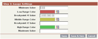
First, keep in mind that the Gauge has several value settings, but you don’t need to fill in all of them. For example, if you’re only tracking actual vs. target, then you only need to set a single breakpoint value:


Here, the target is $3M in sales, as defined in the Breakpoint #1 Value field. Breakpoint #2 and Maximum values are not set.


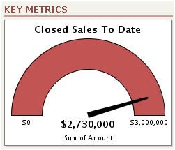
As sales opportunities are closed throughout the reporting cycle, the odometer needle will track toward the $3M target. But what happens next? As we push past the $3M Breakpoint #1 Value, the Gauge component is going to display the sum total of all Sales, and Dashboard viewers will lose visibility as to what their Target value was. Todd’s original question (above) implies that he knew this, and wanted to avoid his sales team losing track of what their Target was after they had passed it.

One simple remedy is to reference the Target in the footer or title fields of the component:


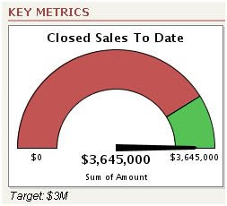
Here, we’ve closed a few more sales, pushing us past the $3M Target. Note that the Middle Range Color (Yellow) was never used, because no value was set for Breakpoint #2. Instead, the Gauge component displays the color of the High Range Color (Green). To help Dashboard viewers recall what our goal was, now that we’ve surpassed it, we added the Target: $3M in the Dashboard footer.


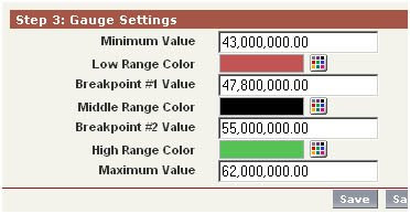
Here’s another example that uses all settings in the Gauge component, including Breakpoint #2 and Max Values. The ABC Company has determined that their extended break-even costs for doing business is $47.8M annually. The current Sales Target is $55M; incentive programs for the entire company have been put in place if Sales exceed a Stretch Target of $62M.

Said a different way: Under 47.8M, the company is in the red. After that, their operating in the black, but Sales has a target of 15% over break-even. Finally, if Sales can push the company 30% of Break-Even, it’s party time, and we fly the entire staff down to Bermuda, with families, for the weekend.

Here’s how the component was mapped out in the Dashboard:


Note that we set the Min Value to $43M, rather than $0.00. This creates some interesting display dynamics as the odometer needle moves toward Target:


Through the early part of the reporting period, the needle stays flat, but the red colored section of the gauge dwindles smaller and smaller as the report total approaches the Minimum Value setting. Once we hit the break-even (Breakpoint #1) of $47.8M, we’re no longer in the red. But even though the company is operating in the black, we haven’t yet hit our sales target ($55M).