I already answered on the LinkedIn Group, but sometimes it’s just easier to show it in pictures. Todd, this blog’s for you!
Gauges are a good dashboard component to use when you want to identify where you measure in a range of values, or against a Target metric. Here are a couple ideas to get your creative juices flowing:
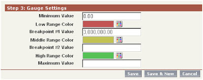
First, keep in mind that the Gauge has several value settings, but you don’t need to fill in all of them. For example, if you’re only tracking actual vs. target, then you only need to set a single breakpoint value:

Here, the target is $3M in sales, as defined in the Breakpoint #1 Value field. Breakpoint #2 and Maximum values are not set.

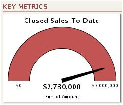
As sales opportunities are closed throughout the reporting cycle, the odometer needle will track toward the $3M target. But what happens next? As we push past the $3M Breakpoint #1 Value, the Gauge component is going to display the sum total of all Sales, and Dashboard viewers will lose visibility as to what their Target value was. Todd’s original question (above) implies that he knew this, and wanted to avoid his sales team losing track of what their Target was after they had passed it.
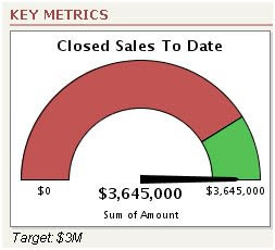
One simple remedy is to reference the Target in the footer or title fields of the component:

Here, we’ve closed a few more sales, pushing us past the $3M Target. Note that the Middle Range Color (Yellow) was never used, because no value was set for Breakpoint #2. Instead, the Gauge component displays the color of the High Range Color (Green). To help Dashboard viewers recall what our goal was, now that we’ve surpassed it, we added the Target: $3M in the Dashboard footer.
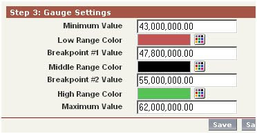
Here’s another example that uses all settings in the Gauge component, including Breakpoint #2 and Max Values. The ABC Company has determined that their extended break-even costs for doing business is $47.8M annually. The current Sales Target is $55M; incentive programs for the entire company have been put in place if Sales exceed a Stretch Target of $62M.
Said a different way: Under 47.8M, the company is in the red. After that, their operating in the black, but Sales has a target of 15% over break-even. Finally, if Sales can push the company 30% of Break-Even, it’s party time, and we fly the entire staff down to Bermuda, with families, for the weekend.
Here’s how the component was mapped out in the Dashboard:

Note that we set the Min Value to $43M, rather than $0.00. This creates some interesting display dynamics as the odometer needle moves toward Target:

Through the early part of the reporting period, the needle stays flat, but the red colored section of the gauge dwindles smaller and smaller as the report total approaches the Minimum Value setting. Once we hit the break-even (Breakpoint #1) of $47.8M, we’re no longer in the red. But even though the company is operating in the black, we haven’t yet hit our sales target ($55M).

No comments:
Post a Comment